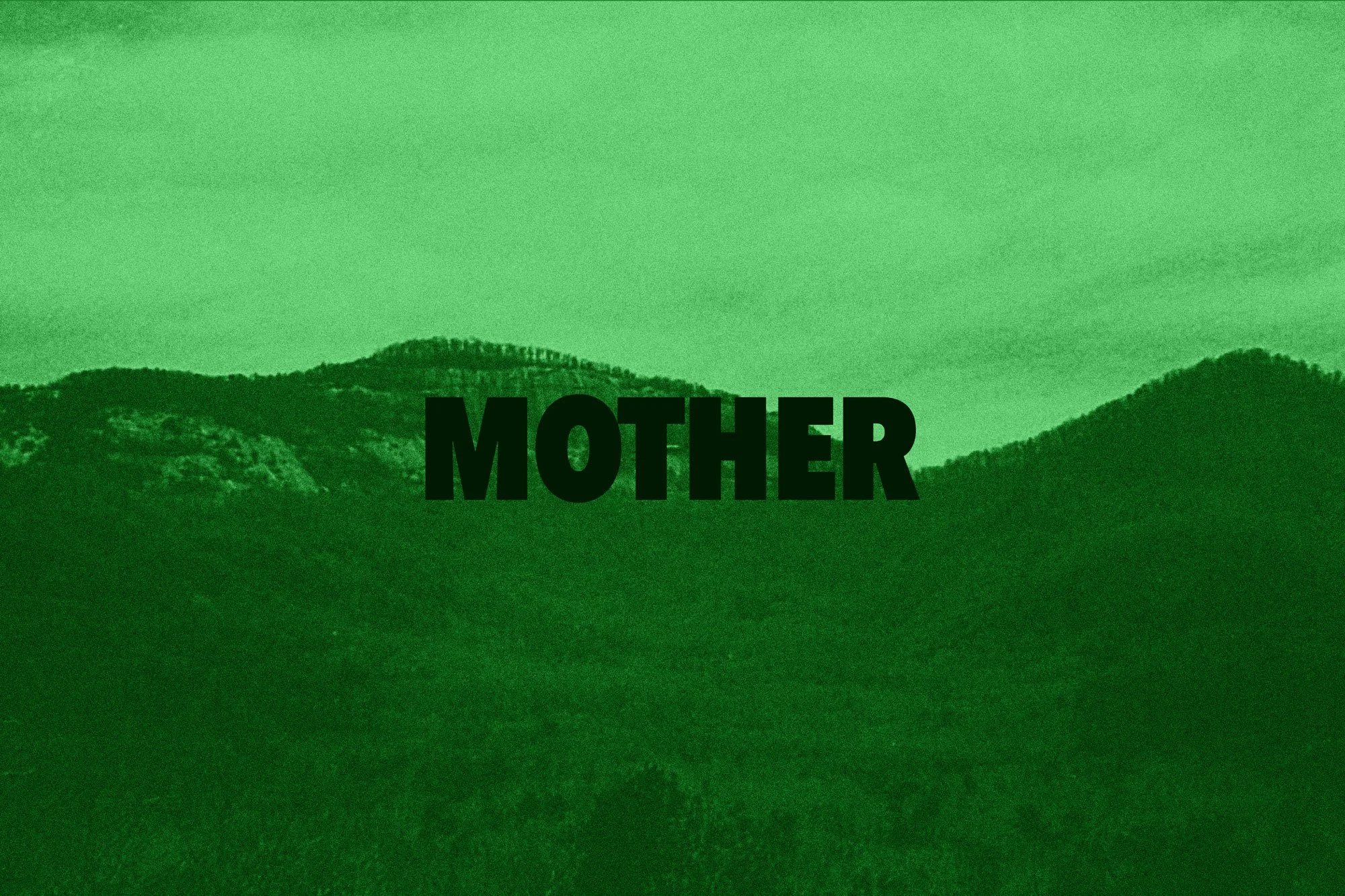
Constant erosion occurs year after year, the race to combat the effects of climate change is of the essence. MOTHER campaign aims to be aggressive in its direction to raise awareness about respecting the fragile ecosystem we all depend on.
MOTHER: Land Conservation
Social & Print Campaign
SERVICESTypography
Print Design
Photography
Animation
Motion Graphic
